Skarven Logos
July 2003
Skarven Enterprises, LLC has a built-in symbol - the skarven, also known
outside Scandanavia as the cormorant. Here are some designs that made
it out of the sketchbook into computer readable form. I hope that we
can choose a better logo than that of our previous places of employment...
The obvious starting point is to export theme and variation combining the
Skarven name and bird. Click on any selected image for a larger version.


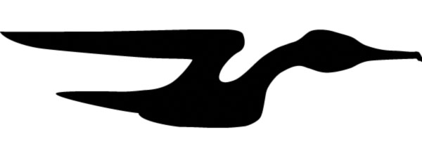
The left logo adds some wings to the "v". This is not bad for an obvious
starting point. The right logo heads in the direction of turning the
"v" into a skarven, along with a little depth. The merits of this direction
are debatable.
We needed an image to improve the appearance of the AWS left browser home
page.

This design attempts to combine an "S" for Skarven and "W" for workstation.
Liberties taken include the length and shape of the Skarven's neck and
the inversion of the wings. The design reminds me of the very effective
previous c.1964 crane-logo
for Japan Airlines (JAL). Recently, I also found that the top skarven.no site has a logo with inverted
wings.
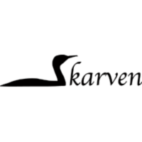
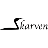
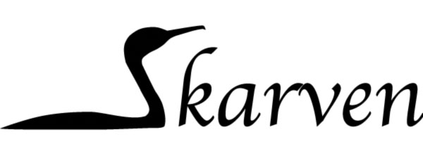
The swimming skarven makes a reasonable "S." The version on the right
pushes the skarven further toward an "S," but too far in my opinion.
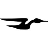
Here's a more stylized skarven. Hmmm... It reminds me of something
familiar... So is that where we got the name "Skarven Enterprises?"

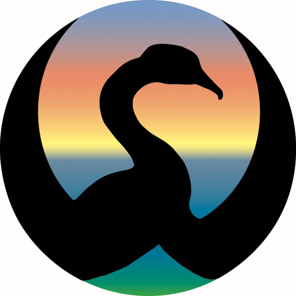
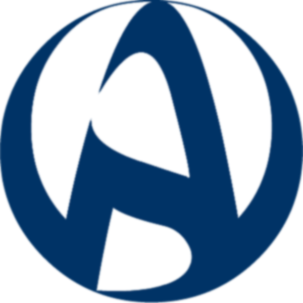
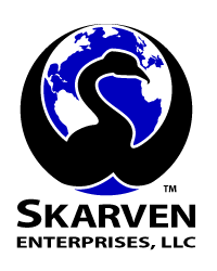
The above is the current company logo, where the background is now a globe.
Thom Lee did the composite.
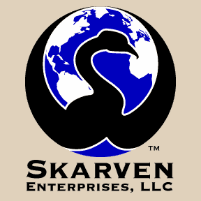
With text, and for the shirt, by Thom Lee.
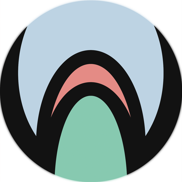
More generic "AW" Analyst Workstation logo redesigned to remove the Skarven branding.

More generic "AWS" Analyst Workstation logo by Thom Lee reincorporates the "S", currently in use.
NoBell Home - gjm
- last update 5/9/2005 - created 7/23/2003